A payment ring is a strange thing to sell. It is jewelry, but it is also a bank card. It has to be beautiful enough to wear every day and trusted enough to hold your money. Get either half wrong and the sale never happens.
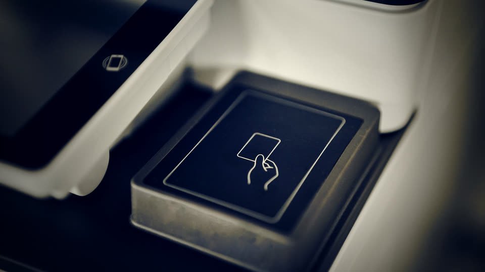
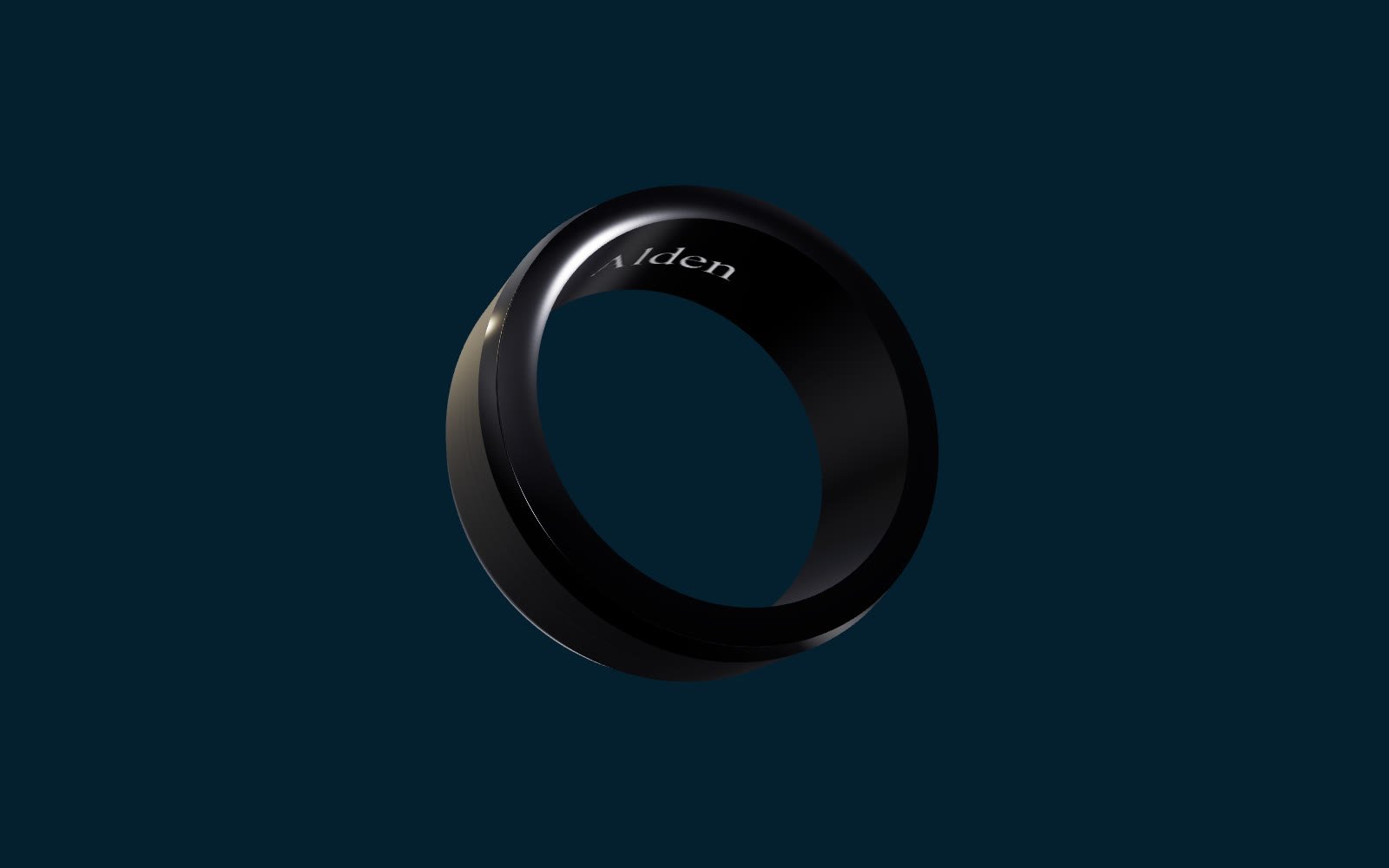
Alden had the product right: full-ceramic rings, certified by Mastercard, tokenized so no card number ever lives on the ring, with no battery to charge and no plastic to expire. What it needed was for people to understand — in the first few seconds — what the ring was, why it was safe, and why they would want one.
That is a communications problem and a technology problem at once. Which is exactly where we work.
Selling a category, not just a product
The obstacle was never the appeal of convenience. Tapping to pay is obviously easier than reaching for a phone or a card. The obstacle was unfamiliarity: "a ring that pays?" raises two questions at the same moment — does it actually work everywhere, and is it safe if I lose it?
Answer both in the first few seconds, or the visitor leaves. Leave either one hanging, and even an interested buyer hesitates.
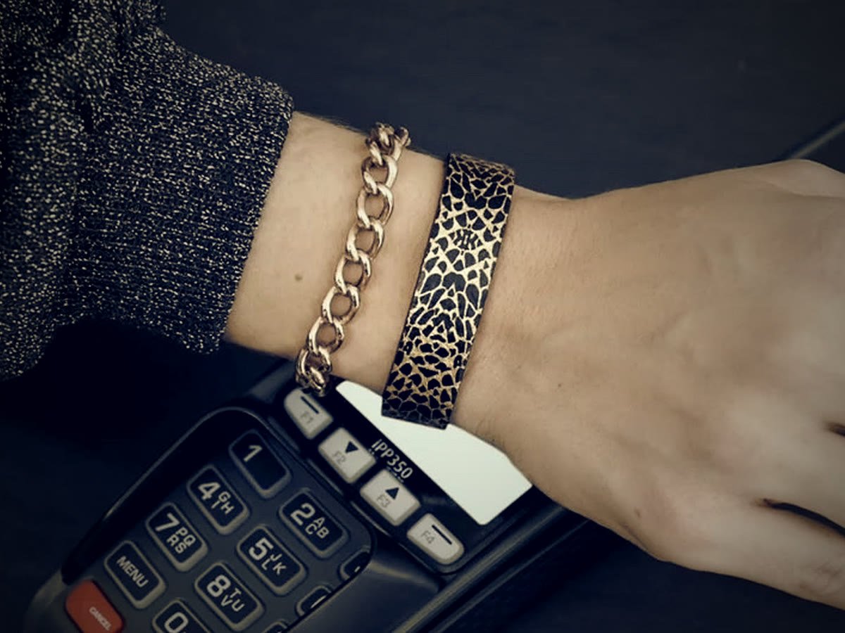
There was a second layer. Alden speaks to two audiences at once — people shopping for a striking accessory, and people curious about a smarter way to pay. The opportunity was to stop treating those as separate pitches and place Alden exactly where it belongs: where jewelry meets fintech, where self-expression and security are the same purchase.
People didn't need convincing that tapping is easier. They needed to believe a ring could be trusted with their money.
One story, from the shelf to the first tap
Built with Alden, the work ran two sides as a single effort: the story people read, and the experience they went through once they bought.
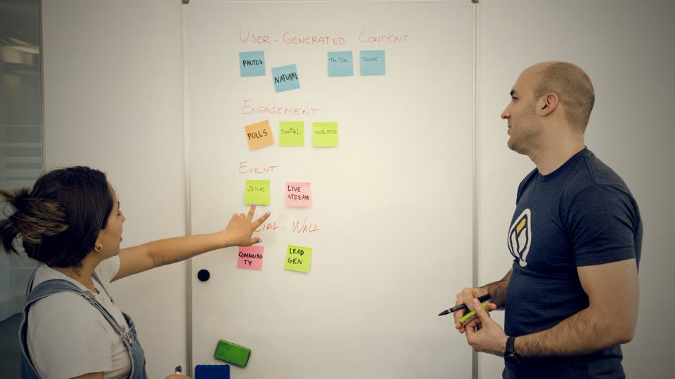
On communications, we built one clear category narrative — tap-to-pay jewelry — anchored in three plain promises. It works anywhere Mastercard contactless is accepted. It is safe, because you can freeze or unlink it instantly from the app if it is ever lost. And it is effortless, because there is no battery to charge and no plastic to expire. Product pages, packaging, and the first-run screens were rebuilt around a single question: what is this, and why do I want it?
On the experience side, we streamlined the path that turns a curious buyer into an active user: linking a bank card, issuing a token, and loading it onto the ring in one short session rather than a scavenger hunt across screens. Working through Mastercard certification and bank onboarding widened the range of cards a customer could actually use.
The two sides shared one rule: nothing was promised on the website that the app could not deliver in the first few minutes. The message and the mechanics stayed on the same page — literally.
The moment the promise on the shelf drifts from the experience in the app, you lose trust in a category that runs entirely on it.
From curiosity to habit
The clearer story and the smoother activation moved the numbers that matter for a young category: more visitors converted, more buyers became active users, and more of them came back.
Product-page conversion rose after the new narrative went live. The time from unboxing to a first successful tap fell to about a minute and a half, and the app's store rating climbed as first-run friction disappeared. Support tickets and returns tied to "how do I set it up" dropped in step.
The category language stuck, too. Customers began describing the product in their own words — "my payment ring" — and gifting emerged as a signature use case, exactly the kind of word-of-mouth a new category needs to grow.
Alden made a new category feel obvious. Customers stopped asking whether it works and started asking which ring to buy.